I am a recent Rutgers Data Science Bootcamp graduate looking to explore positions in the data science/programming world where I can apply my knowledge/skills attained from this six month intensive bootcamp. Throughout my time here, I have demonstrated the ability to learn fast, adapt to uncomfortablity, and to stay focused. In the group projects, I was very instrumental in organizing analysis, communicating effectively, and concisely and clearly delivering conclusions. Looking to leverage my knowledge, skills, and passion of analyzing data in a thriving professional environment. At the very bottom of the page is my contact information.
SKILLS:
Writing html/deploying, using git and version control, writing SQL queries, web-scraping, using fundamental JavaScript, incorporating classification machine learning, creating/analyzing visualizations in Tableau, using Python APIs, and pivotting tables in Excel.
Excel Visualizations/Analysis
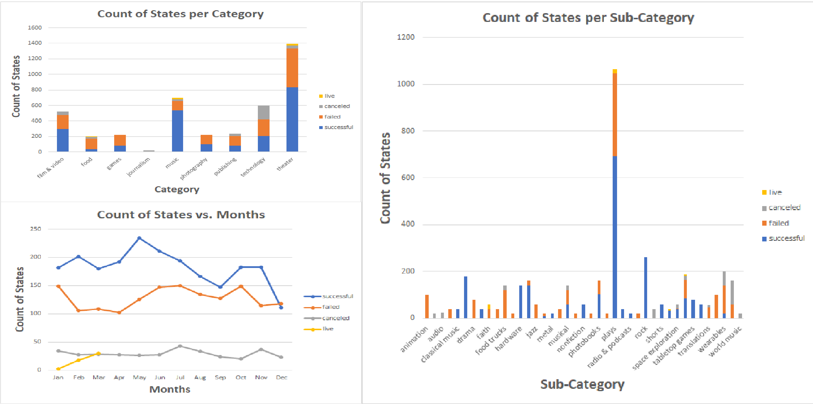
I used Excel to analyze the data of 4,000 past Kickstarter projects to uncover market trends.
I used conditional formatting, created pivot tables, and a variety of charts to draw conclusions and to understand limitations of the dataset.
Web Visualization Dashboard
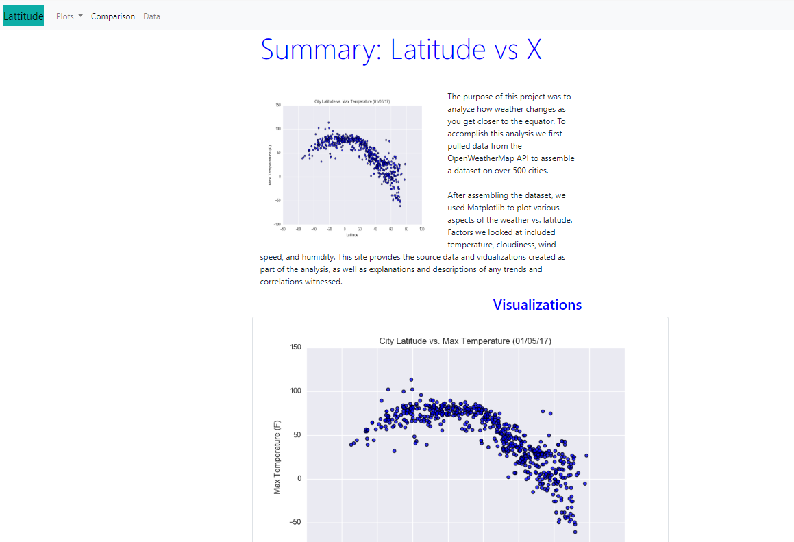
I created a web dashboard consisting of 7 pages in total to display the latitude analysis using HTML, CSS, and Bootstrap. These pages include:
1) A landing page of the dashboard
2) Four visualization pages of different plots vs. latitude
3) A comparisons page
4) A data page
JavaScript - UFO Sightings
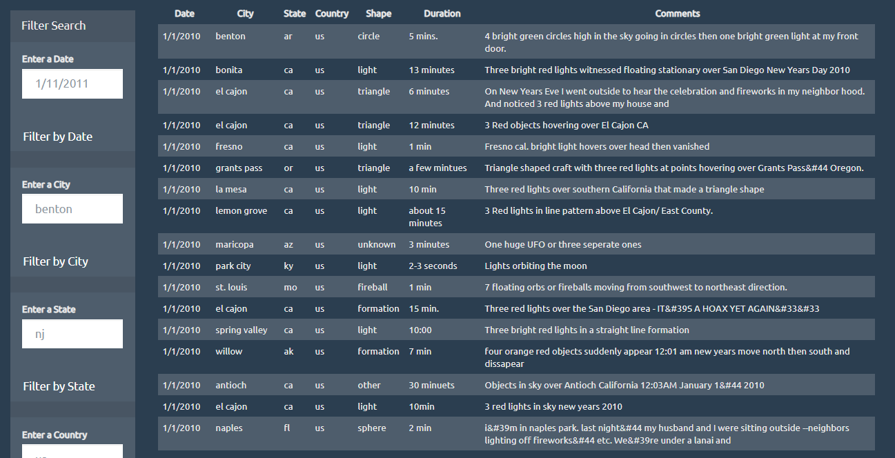
I built a basic HTML web page using JavaScript and CSS so that the user can set multiple filters and search for ufo sightings by table column.
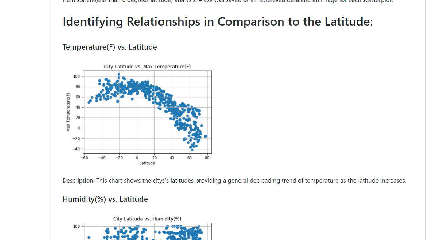
I created a python script to visualize the weather of 500 + cities across the world in terms of distance from the equator. Different libraries such as OpenWeatherMap, Citipy, Matplotlib, and Pandas helped to build scatterplots to show different relationships. A linear regression model helped to provide analysis between the Northern and Southern Hemispheres.
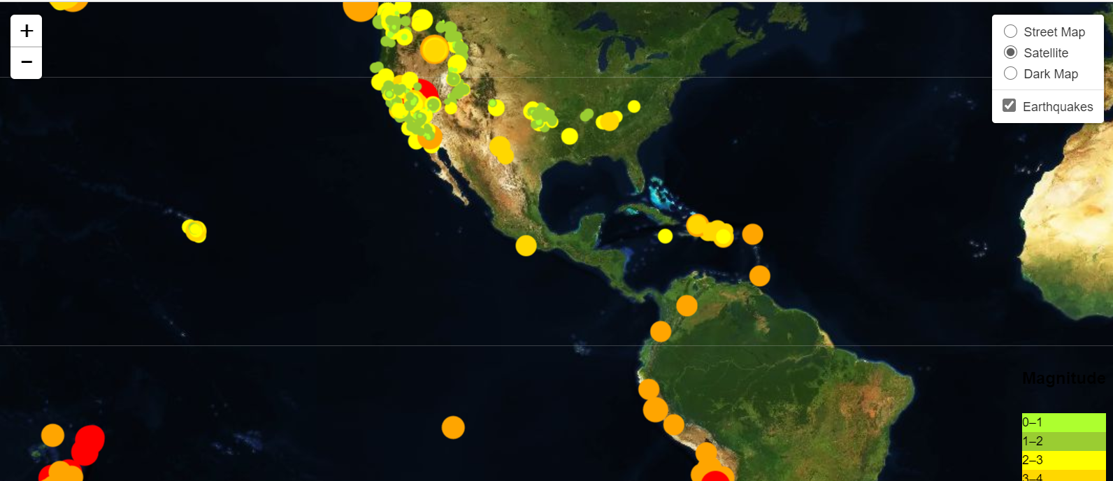
With the help of the JavaScript API call from the Mapbox website and the leaflet library of JavaScript, I was able to display a satellite map, a basic (street) map, and a dark map of the earthquakes that took place from a 7 day period stretch (constantly updated on USGS website). The earthquakes that had a higher magnitude were more darker in color, specifically orange to red. Upon clicking the circles, you will see a tooltip about a particular earthquake that displays information such as distance from a particular city, time of earthquake, and the magnitude.
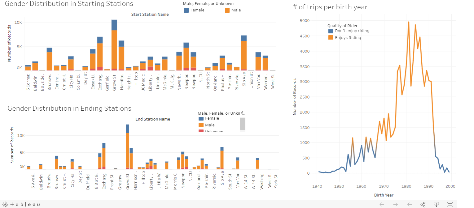
Ten sheets, two stories, and two dashboards were created to convey the analysis uncovered from the Jersey City (JC) bike data csv. Number of bike trips (listed as numbers of records) was the main variable used throughout the analysis. Analysis was broken down between the starting stations and the ending stations. Two maps were created to display which starting and ending stations had the most number of bike trips. Turns out, Grove St. Path Station had the most amount of trips in both as a starting and an ending station. In addition, several calculated fields were created such as classifying whether a station is busy or moderate and whether a biker enjoys riding based on a number of trips a biker takes. In dashboard 1, it was seen that more bikers, riding from starting stations in totality, enjoyed riding than in comparison to the bikers reaching the ending stations. More stations were classified as busy in the starting stations than in the ending stations. In dashboard 2, we see the gender distribution across all stations (both starting and ending) in a stacked bar chart. In all, I concluded that most bikers were males and very few were unknown.
Project Details:
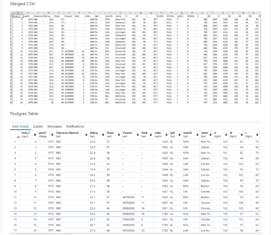
Beautiful soup library and basic python was used to demonstrate the ETL process. Two sources of data were used. Beautiful soup allowed the capability to scrape the World Series viewership statistics from the website https://www.baseball-almanac.com/ws/wstv.shtml from 1973 onwards. I obtained another csv from Kaggle, where I downloaded it. It was then read as a dataframe with python. The two dataframes were then cleaned, joined by the team ID, merged, and loaded into Postgres database.
Project Details:
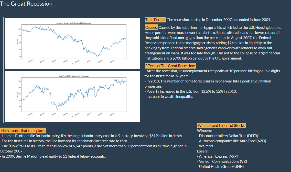
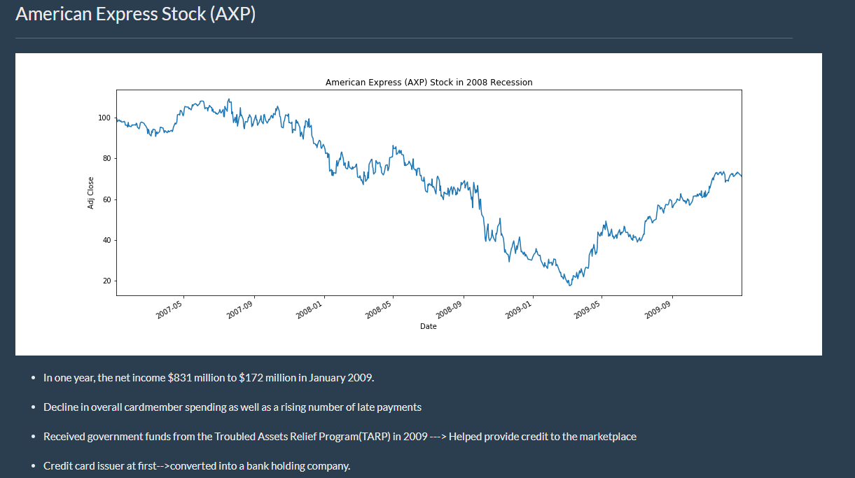
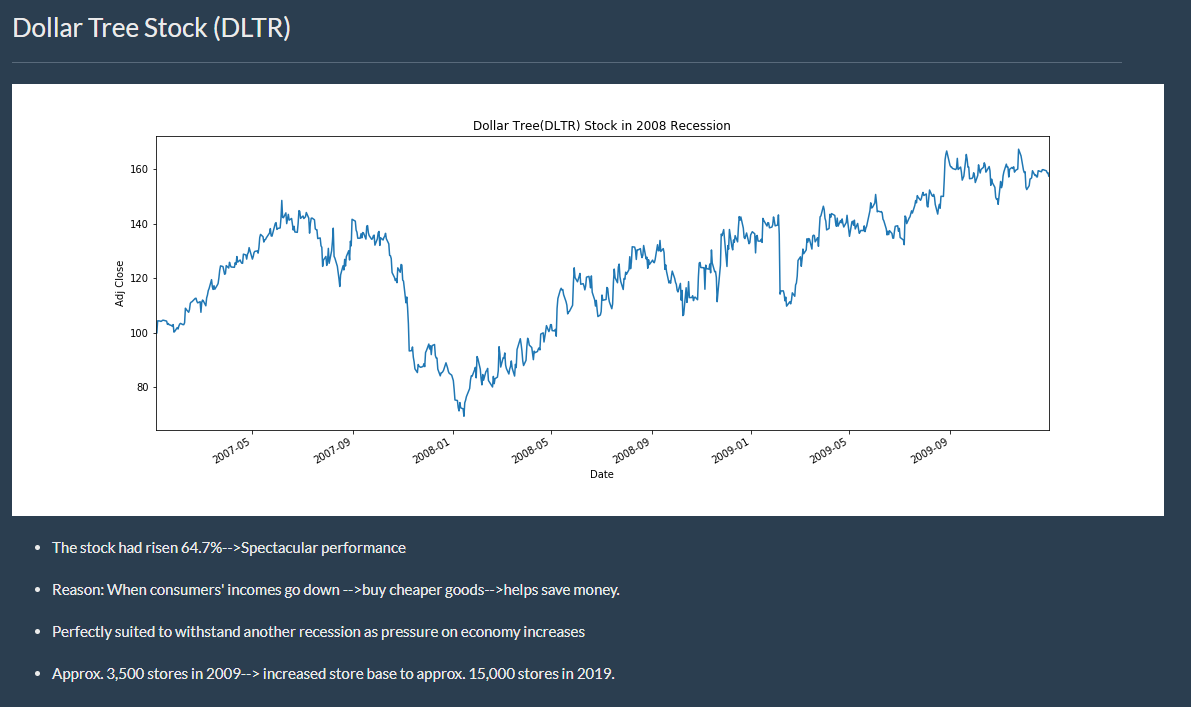
This project was geared to providing users with insights on the different recessions that occurred in the U.S. and to give a visual display on how certain stocks/industries were affected. I took responsiblity for shedding light on The Great Recession. Yahoo Finance was the source of the information on the stocks. In doing so, I used Pandas Datareader, HTML, and CSS to construct a web page to inform others about The Great Recession. Furthermore, two charts were created showing a stock which did spectacular (Dollar Tree Stock) and a stock which did poorly (American Express Stock).
Machine Learning - Stock Price Trend
Project Details:
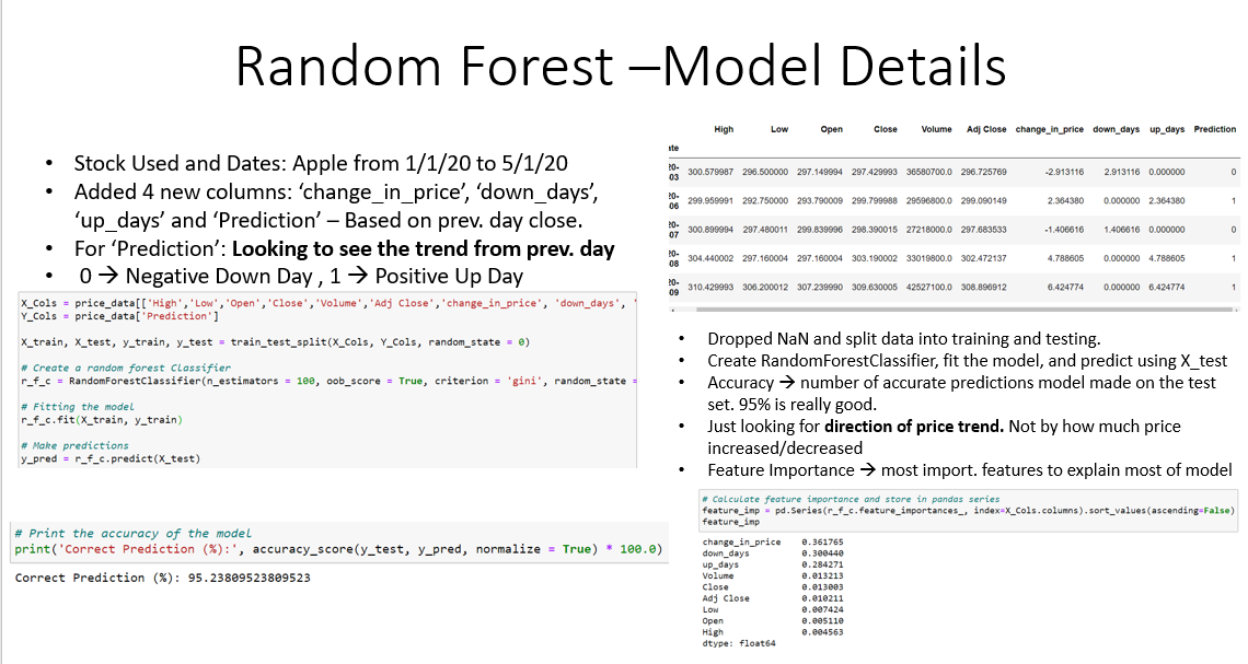
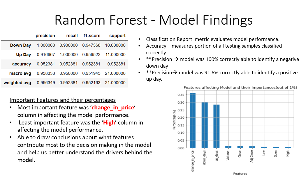
The stock I used was Apple from January 1st, 2020 to May 1st, 2020. I used a Random Forest Classification Algorithm to determine whether the trend of the closing price would finish up or down from the day before. The model was then trained, tested, and produced an accuracy of about 95%. The accuracy just takes into account whether the closing price finishes up or down from the previous day but not taking into account by how much numerically. A prediction column was created to label 0 for down day and 1 for an up day. The classification report metric was used to evaluate the model performance. The inbuilt 'feature_importance' tool was used to see the most important features driving the model. It turns out the column 'change_in_price' (closing price) was the most important feature driving this model.